The psychology of colour in branding: 2025’s mood-driven palette
Colour is a portal to emotion, from vibrancy to anger or energy to gloom – its use in advertising and content seems to reach into our consciousness before we are aware of it – influencing our thoughts, emotions and responses.
In 2025, colour strategy in digital branding is the sinew that connects ideas and the sequence of how we view things. A cool calming palette could be disruptive in the frenzy of a viewer’s typical day on social media – just as a warm, striking orange could enliven a meditation app with unexpected vibrancy.
This blog will explore how colour psychology continues to influence branding, user experience and adaptive systems in the digital and branding world. Read on to find out some fascinating new facts, but also be reminded about what you already intrinsically know and perceive in the real world every day.
Why colour still holds strategic power
A significant amount of first impressions are influenced by colour – like road signs of how to feel. Colour can trigger neurotransmitters (dopamine, serotonin), affecting emotional states – from dour, funereal colours of mourning to vibrant, breakfast time colours – we need not even name the colours but instead simply describe the context of their use for us to imagine what they might be.
Integrity Malts: Crafting a product-led colour strategy
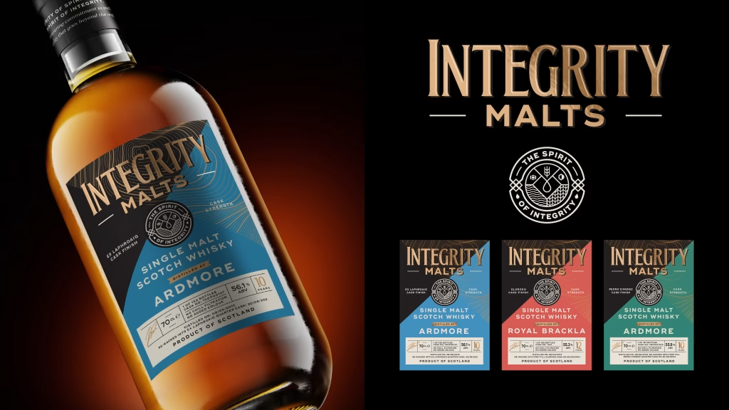
Integrity Malts: With this client, we explored how colour psychology influences whisky purchasing decisions. We selected soft shades that align with traditional whisky flavour profiles, ensuring clear category differentiation on crowded shelves. The pairing of these gentle tones with black and luxurious gold foil created the premium positioning Integrity Malts needed to compete in the independent market.
Colours reach deep into us, accessing cultural memory but also what is intrinsic. Blue is globally considered the most trustworthy colour (preferred by 54% of consumers for brands), could this be linked to millions of years of the cultural unconscious or the concerted efforts of ad companies throughout contemporary culture…? Probably both.
The use of colour in buyer psychology is paramount and is extremely relevant to the customer journey. Red, for example, can boost CTA engagement by over 21% due to its energising, urgency-driven qualities – the desire to ‘push the button’ coupled with the urgency of alarms commands our attention. The effect of colour is so intrinsic, that it has a physical effect on the human body, with green and soft blues promoting calm – which explains their common use in wellness and meditation apps.
Strategic colour control with Metallix
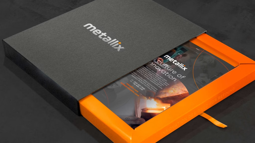
Restraint can be the most powerful use of colour. In this sense we are proud of our work for Metallix, a prominent brand in the precious metal refining industry. Our guidelines demonstrate that a single colour can be a brand’s secret weapon – in this case a powerful orange. We established strict parameters for this striking hue to avoid overwhelming the visual landscape, commanding attention without causing fatigue. Our guidelines ensure that whether online or offline, every touchpoint maintains the same sophisticated balance. The orange has become a tool of emphasis rather than decoration – a flash of energy in an otherwise refined palette.
2025’s mood-driven palette
Comfort and calm
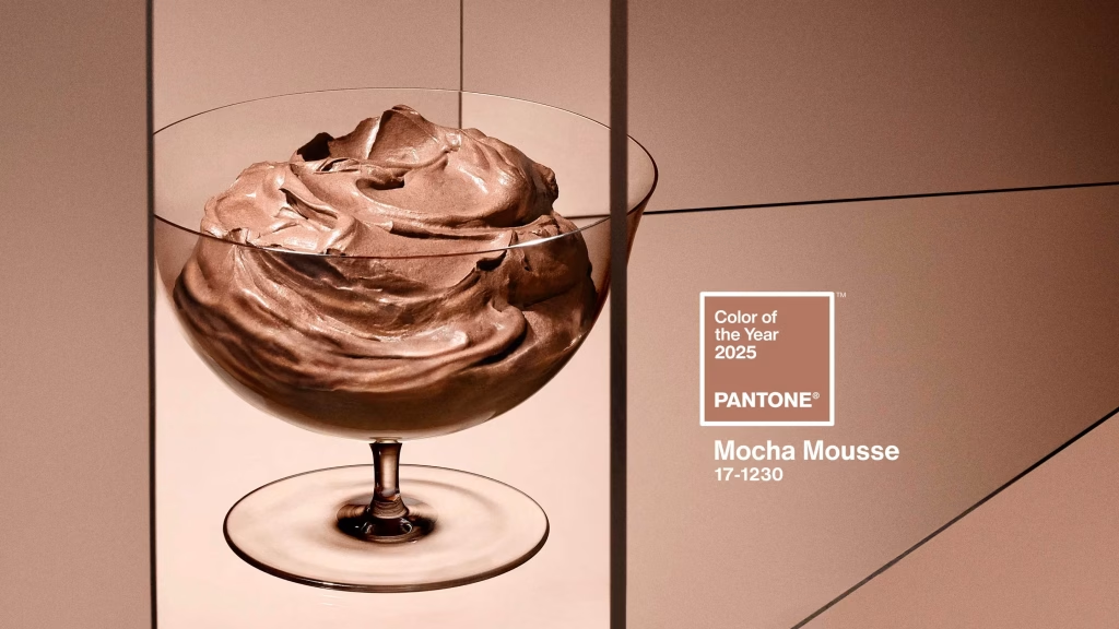
Pantone, a company that provides standardised colour matching systems used across various industries, revealed that their 2025 Colour of the Year is Mocha Mousse, a warm, grounding brown linked to stability…Who would have thought that a desire for the dusky serenade of such colours would be the defining colour for 2025, a reaction perhaps to the turmoil of recent years?
Muted palettes (soft blues, creams, pastels) are gaining traction for their calming, low-fatigue aesthetic with butter yellow identified as a soothing tone to combat screen fatigue.
Nature and sustainability
Earthy tones like moss green, terracotta, and oat hues signal eco-consciousness and authenticity. This is particularly valuable if a brand is involved in or produces foods or goods that benefit from advocating for fair trade or the necessity of protecting green spaces.
Further down the rabbit hole reveals the nature of biophilic design, which is an architectural and interior design approach that aims to connect building occupants more closely with nature – we often see innovation that develops colour in this universal perspective. WGSN is a ‘trend forecasting company that supplies global brands with consumer and product design forecasts’ and their 2026 colour of the year will be Transformative Teal, a colour that blends blue and green to reflect a planet-first mindset.
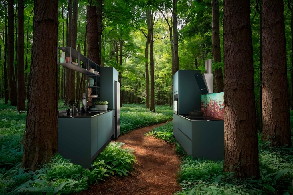
At Vivid, we’ve seen firsthand how sustainability-driven colour strategies can transform brand perception. Our work with Symphony Group on their trending colours and sustainability agenda demonstrates this evolution in practice. By creating AI-generated imagery of natural materials for their sustainable kitchen ranges, we helped visualise how eco-conscious design could blend seamlessly with contemporary aesthetics. These nature-inspired visuals not only reinforced their environmental commitment but also created an emotional connection with consumers seeking authentic, planet-first choices.
Contrast and nostalgia
Fashion moves in circles; one only needs to look around the streets to see the fresh take that young adults have on 90’s fashion – in this spirit we see a “New Nostalgia” trend in branding that blends retro colours (lavender, coral, electric pinks) with modern applications. This fascinating evolution brings together the considerable development of technology with a trusted feel in design, allowing modern items and connectivity to complement human life without detaching us from it.
Social media aesthetics are also quickly evolving – we see this with the influence of hyper-pop, defined as a ‘micro-genre of electronic music characterised by its maximalist, often experimental, take on pop music’ – these trends are fuelling demand for vibrant, screen-optimised colour.
Vivato: Energising through vibrant colour
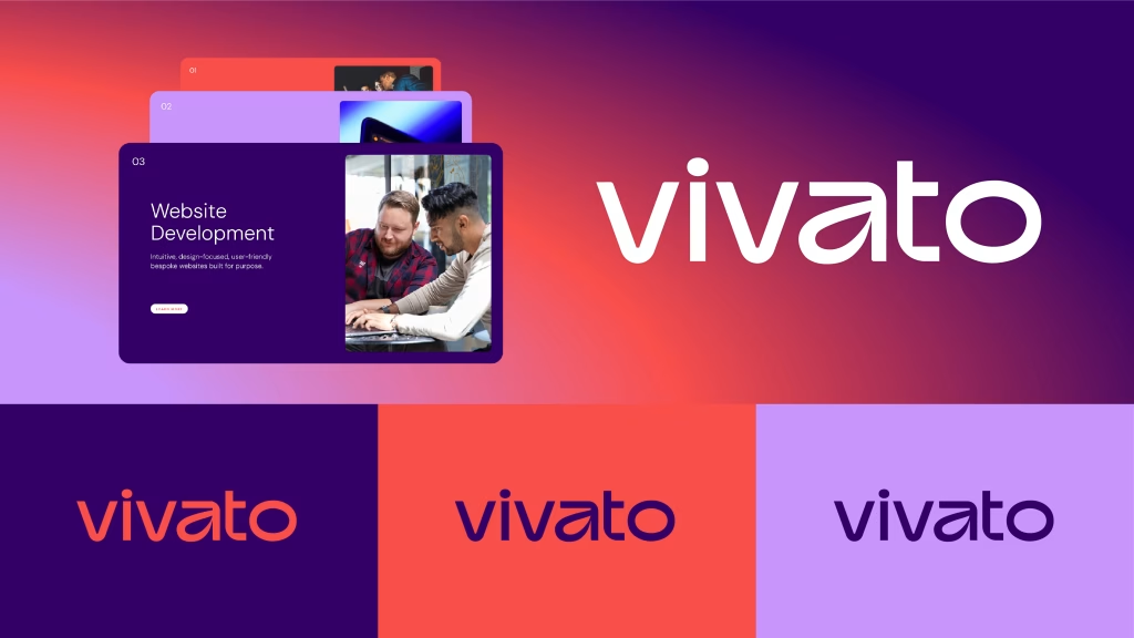
Vivato: For Vivato’s rebrand, we embraced vibrant colours typically associated with energy and digital innovation. This three-way palette system was strategically applied across their service offerings, creating dynamic variation throughout their website while maintaining brand coherence. The result energises their digital presence.
How brands are responding digitally in 2025
Emotional connection
Brands are using soft neutrals and pastels to build emotional trust – palettes that create a sense of calm and simplicity. This can align with brand values of transparency, wellness and comfort in an increasingly overstimulated digital space.
Calm-coloured
We see wellness brands rely on blue for serenity, green for balance and neutrals for accessibility – going beyond the calming psychological associations, these colours communicate the concepts of nature, safety and openness across digital touchpoints.
Taking it easy on the eye
Dark mode strategies with devices favour desaturated tones and avoid pure black to reduce eye strain. This approach maintains brand consistency while offering a softer, more user-friendly viewing experience. This is especially important for apps and interfaces used at night.
WCAG (Web Content Accessibility Guidelines) standards now widely adopted
Forward-thinking companies are treating accessibility not as a minimum standard, but as a strategic advantage that enhances user trust and inclusivity.
Communicating beyond colour
Colour-blind accessibility is increasingly addressed through cues (icons, text, structural changes). By relying on more than just colour to convey information, these brands ensure usability for a wider audience, including the estimated 300 million people with some form of colour vision deficiency.
VITTA: Building trust with corporate blues
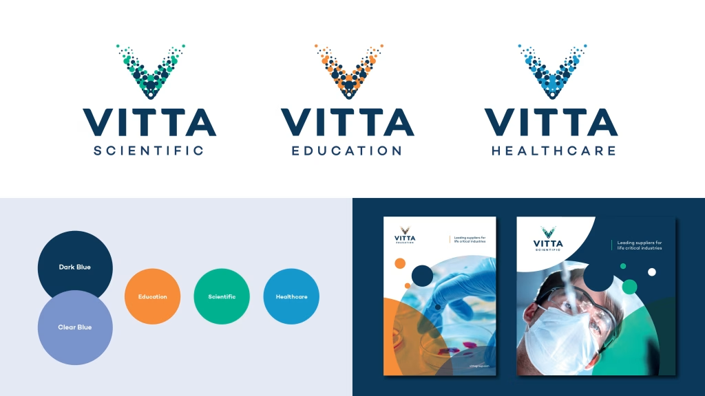
VITTA: Working with VITTA, we leveraged the trust and stability inherent in corporate blues. Dark and mid-blue tones established authority and continuity across the master brand, while carefully selected bright accent colours gave each sub-brand its own distinct identity. This hierarchical colour system ensures clarity in their service architecture without sacrificing unity.
Looking ahead: Personalised and adaptive systems
30% of users express interest in adaptive ‘living’ palettes that reflect personal mood or preferences. With our intrinsic understanding of colour, its effect on our emotions, outlook and well-being, it’s interesting to wonder how technology, AI and future branding will aid in this evolution.
The colour of the future
We can now understand that digital colour isn’t just visual but a core component of an emotional design strategy. Its use is hardwired into the success of a campaign and is a determiner for its emotive effect and messaging. Brands that embrace comfort, accessibility, and adaptive systems will build deeper trust and resonance. This could indicate a continued shift away from grabbing attention to greater support of emotional wellbeing.
Giftfinder: Luxury meets sustainability in green
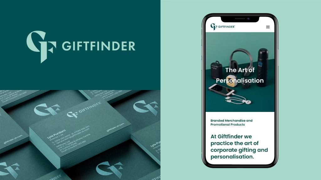
Giftfinder: For Giftfinder, we developed a luxury green palette centred on deep emerald – a colour that psychologically aligns with both premium quality and growth. We paired this with a lighter complementary green to acknowledge their commitment to sustainable sourcing and ethical practices, creating a colour story that communicates both luxury and responsibility.
Is your brand’s colour strategy working as hard as it could be?
Your visual identity is often the first thing your audience notices and remembers. if your colour choices don’t align with your brand’s message, values, or user expectations, you could be missing out.
Ready to make your brand resonate more deeply?
Explore our work or get in touch to start a conversation.
View All Blog Posts →