Engineering the future
for FAIRFIELDS

A strategic rebrand and website project that united three engineering brands into one powerful identity for a leading UK engineering group.
FAIRFIELDS delivers integrated Engineering, Control Systems, and Digital solutions for complex operational environments, from concept and delivery to ongoing support.
With 70+ engineers working across multiple locations at the nexus of mechanical and electrical engineering, control and automation systems and digital/IIoT technology, their capability was never in question – the question was the consolidation and future of the brand.
+132%
Engineering Landing Page Sessions
+16%
Organic Search Clicks
+68%
Avg. Site Wide Engagement Time
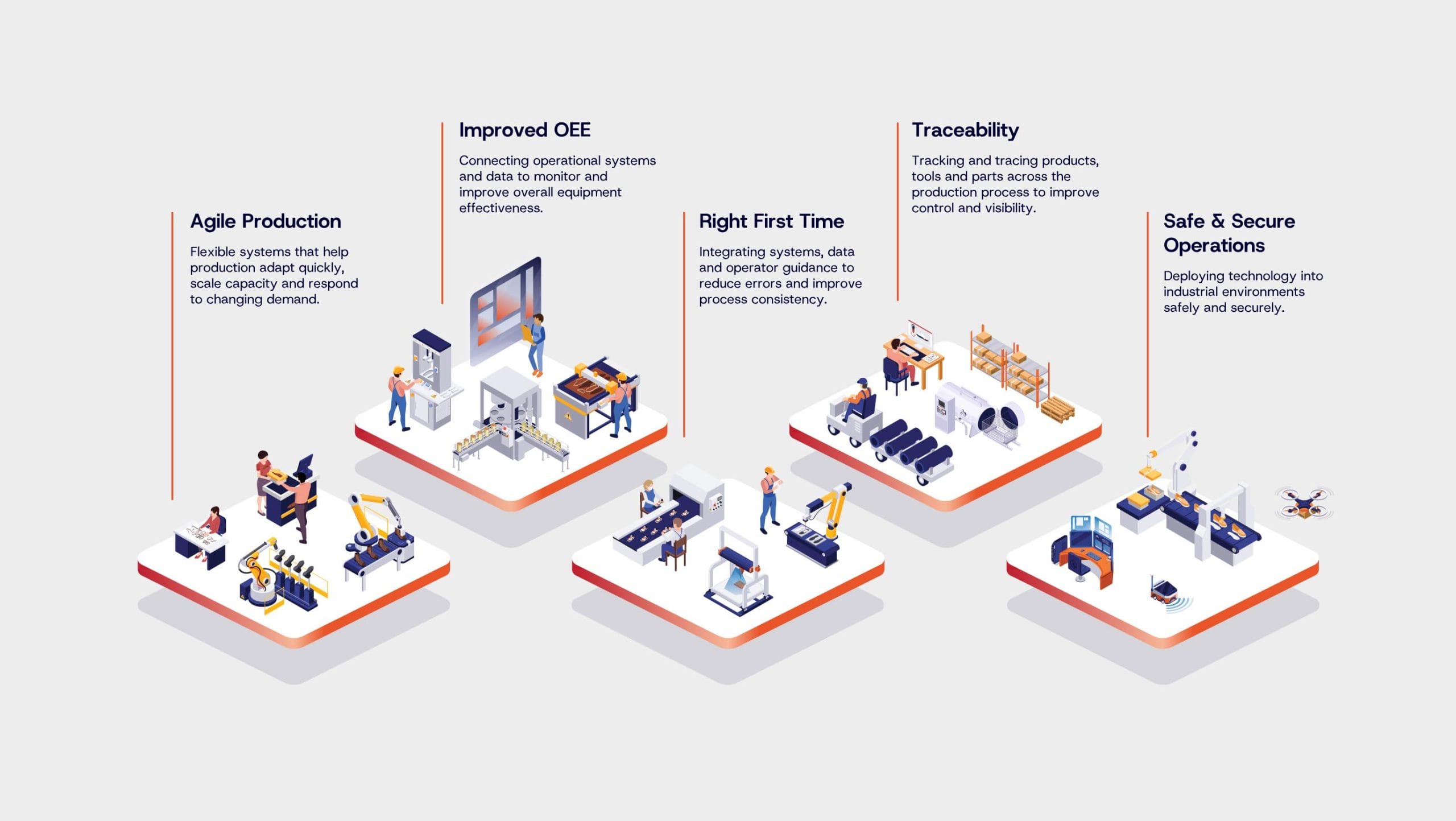
Multiple specialisms
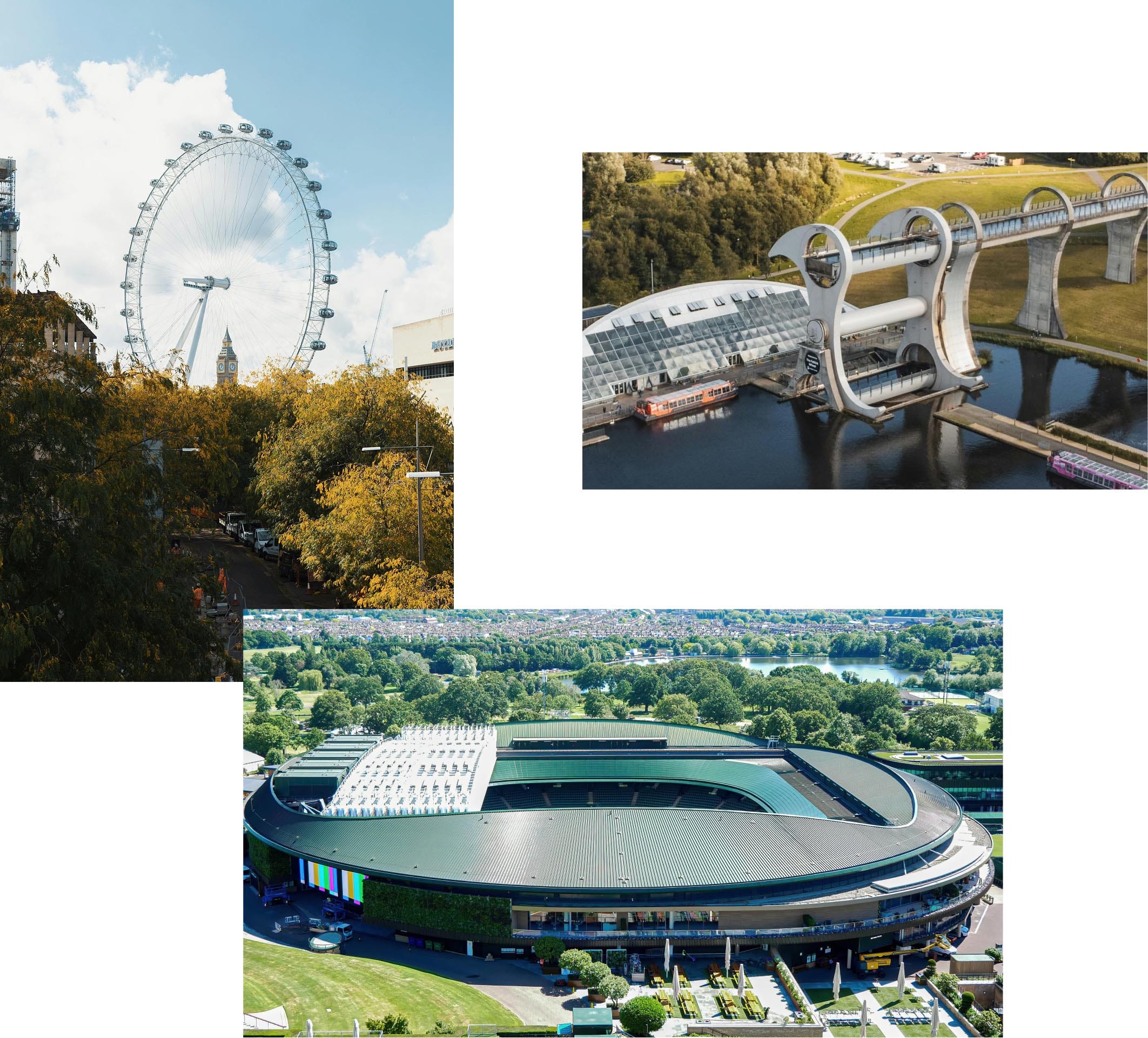
Their extensive project history includes the retractable roof at Wimbledon, the Falkirk Wheel, and advanced factory-of-the-future installations for BAE Systems. Where the cost of failure can be critical, FAIRFIELDS is a trusted partner in delivering reliable, practical solutions.
The company was operating under two well-established trade names: Fairfield Control Systems (FCS) – a top ten UK system integrator; and Fairfield Engineering Solutions (FES) – a full-service mechanical and electrical specialist.
A developing Digital/IIoT capability was being established and would need to be incorporated into FAIRFIELDS‘ wider service offering.
Crafting a unified brand
FAIRFIELDS has an excellent reputation in the engineering and control industries, but it became clear that a more unified brand identity and positioning was needed.
FCS and FES developed separately over many years with their own logos, colour palettes and cultures. Employees identified primarily with their department and specialisms and secondarily with the group. Engineering teams and control teams operated mainly in separate silos, with each team operating under their respective brand identity – creating distance between them.
The website reflected the same level of disconnect and was structured similarly to two completely independent companies operating under one domain name. There were also inconsistencies across customer contact points in terms of branded documents, email signatures and marketing materials.
Our challenge was to unify FAIRFIELDS under a core brand identity, to unify the business internally, and build a clear service offering to its existing customers and the wider market.
One business not three
We conducted a series of discovery workshops with FAIRFIELDS’ senior leadership teams, department heads and key employees. The output of these sessions culminated in a clear strategic recommendation: FAIRFIELDS does not require multiple brands. It requires only one.
We crafted a new position for the business – Integral.
To its customers, FAIRFIELDS is the partner that can be trusted to design, build and integrate complex engineering, control, and digital systems. By reducing risk, improving performance, and streamlining delivery – we are perceived as being integral to our customers’ aspirations and operations.
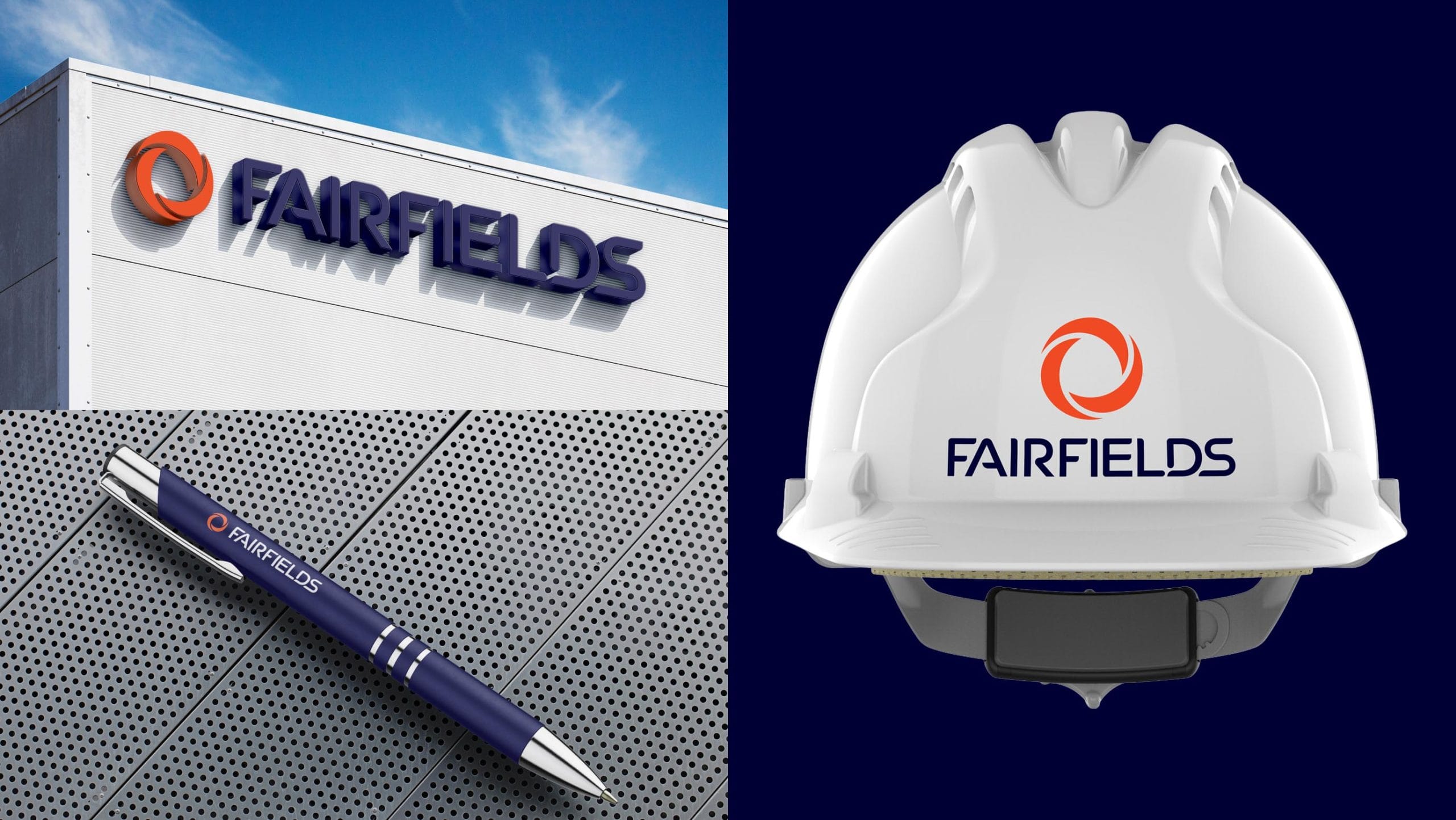
One FAIRFIELDS Identity
Instead of creating a suite of sub-brands (for example, engineering, control, digital and maintenance) for each area of the business, Vivid recommended to position FAIRFIELDS as a singular unified brand identity: Engineering, Control and Digital are not separate businesses – they are the component parts of an integrated proposition and the brand needs to represent that.
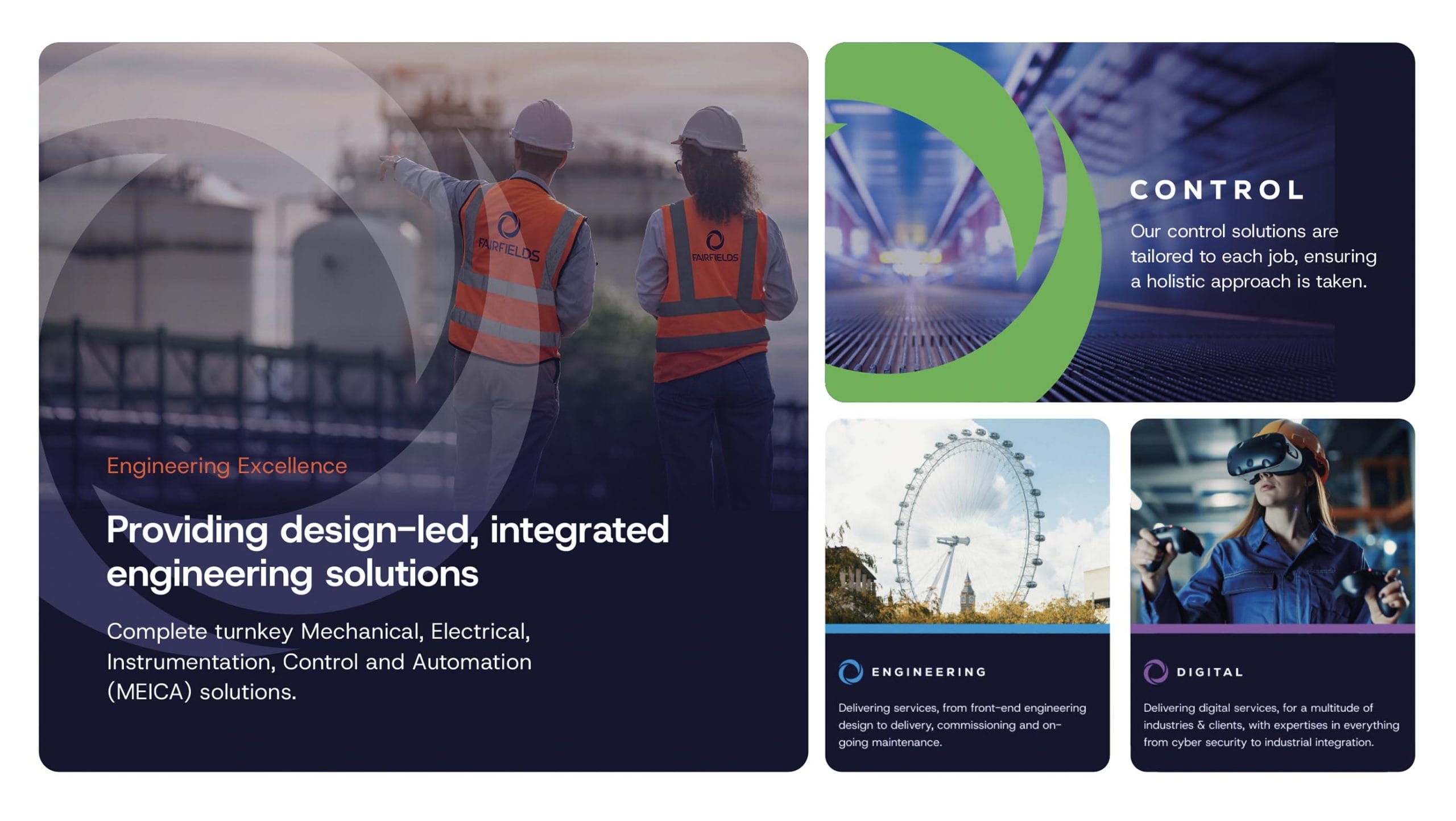
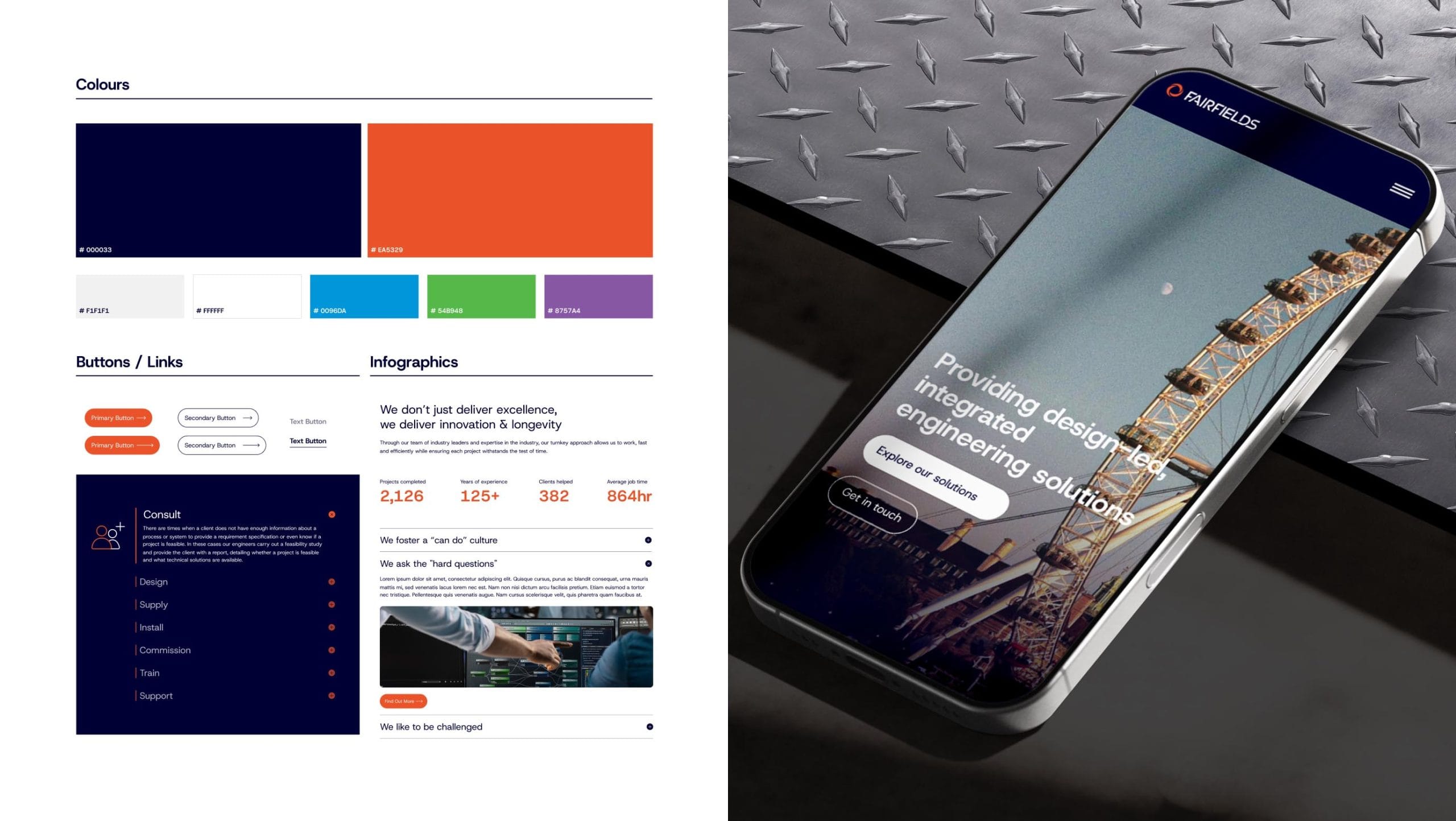
The FAIRFIELDS identity represents the convergence of the group’s three abilities under one single cohesive marque. The typeface was customised to bridge the engineering heritage of the company and its progressive digital nature. Colour was maintained as a method of wayfinding and each speciality carried a refreshed legacy colour palette used as accent or call-to-action colours.
A Complete Brand Experience
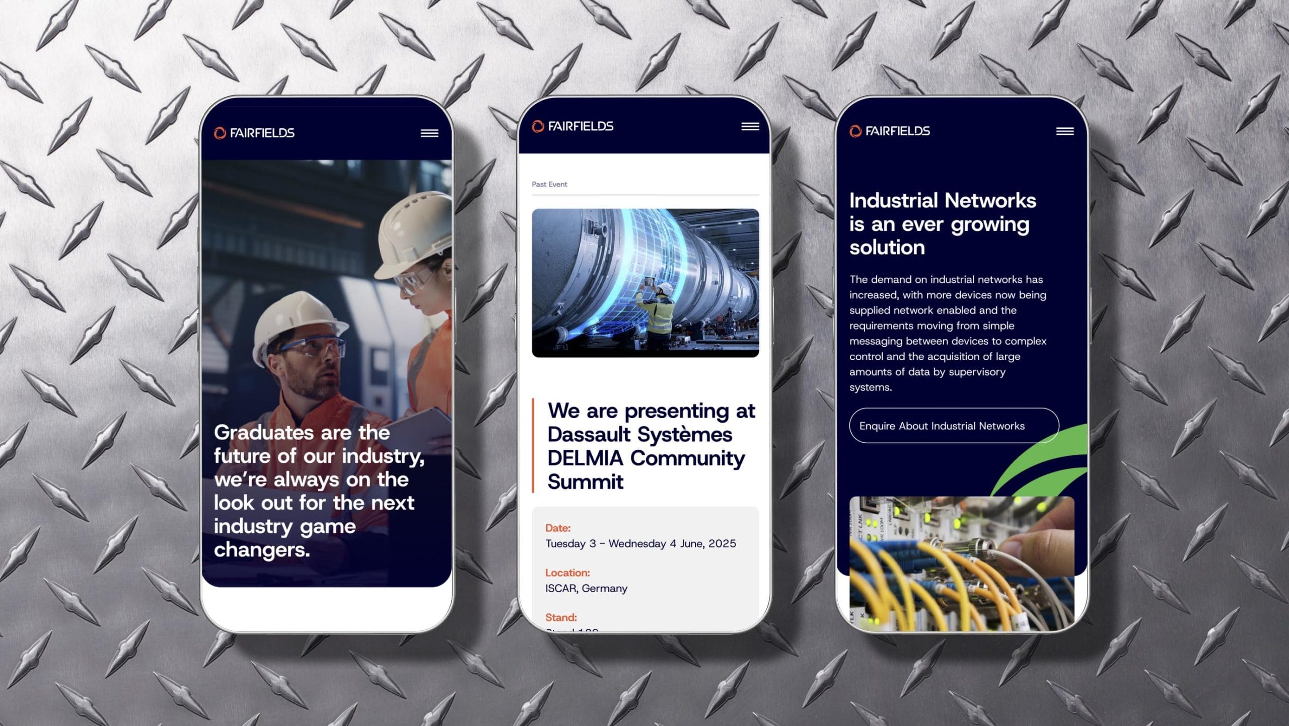
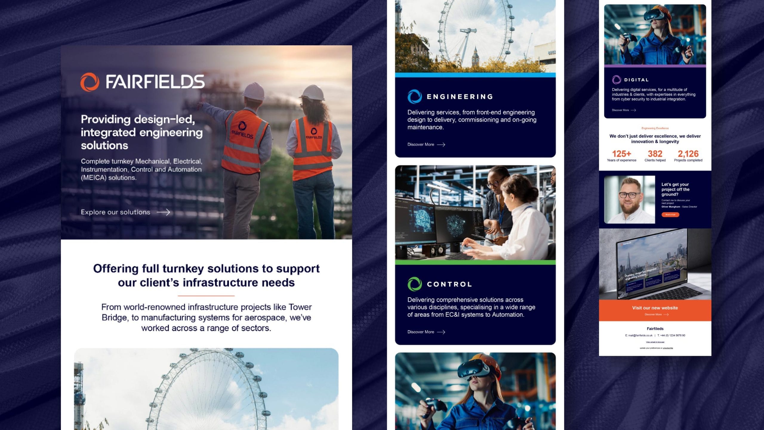
We designed and developed a new website that integrated each of FAIRFIELDS’ core specialisms in Engineering, Control, and Digital, with a clear focus on its combined expertise in solutions, sectors and project delivery.
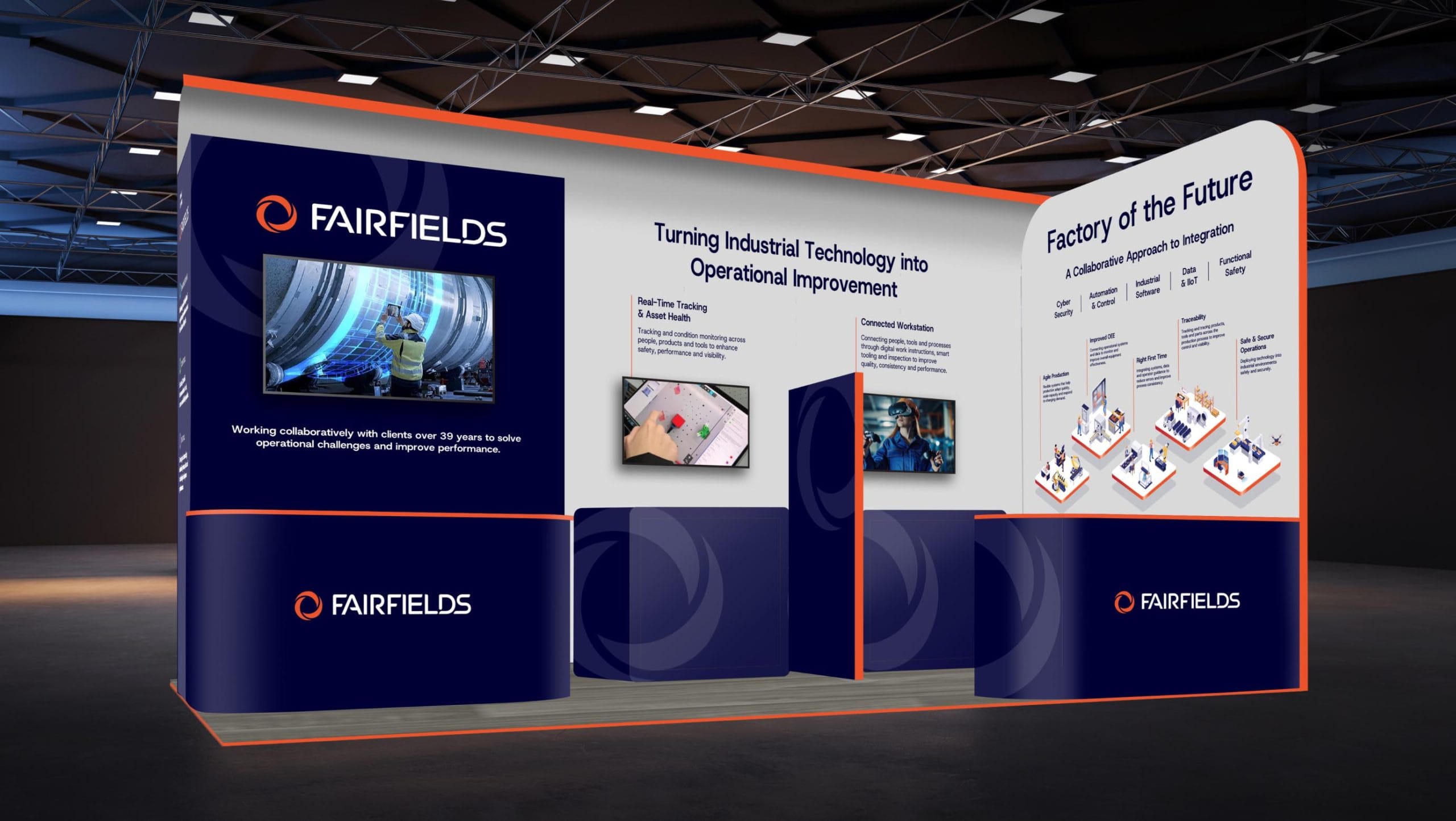
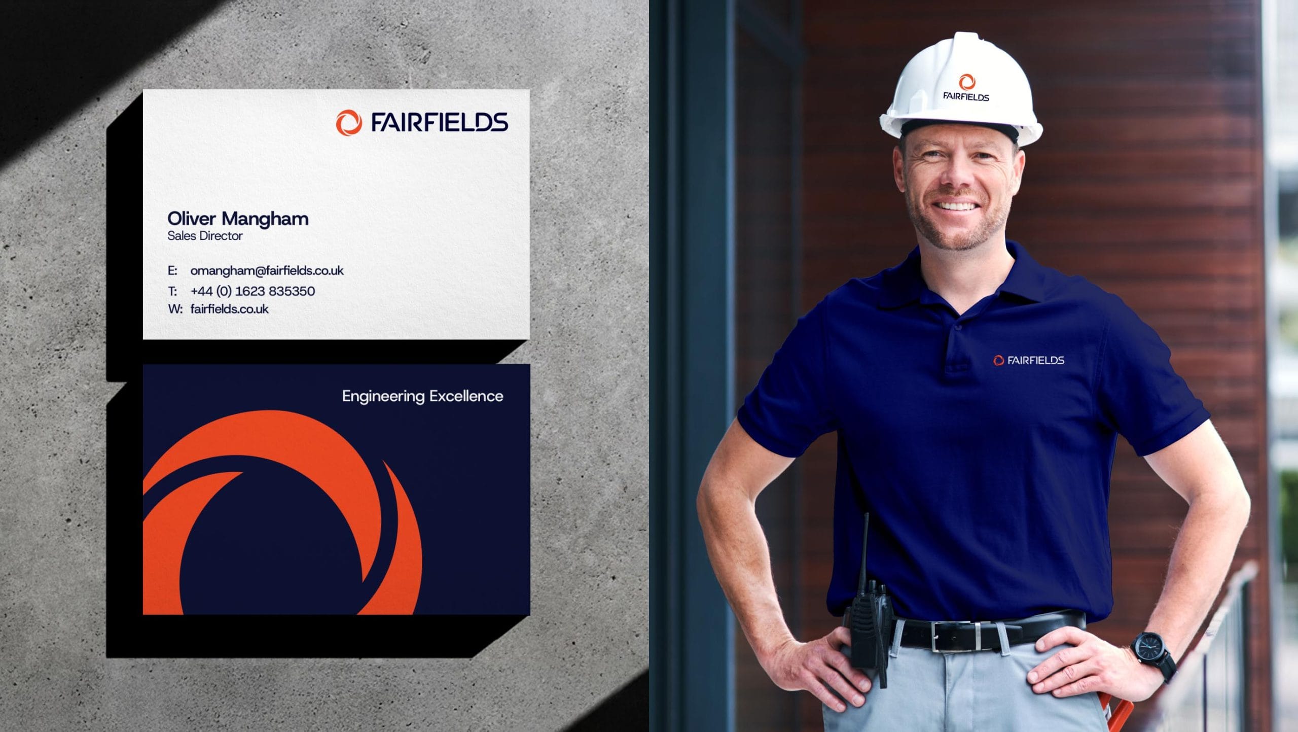
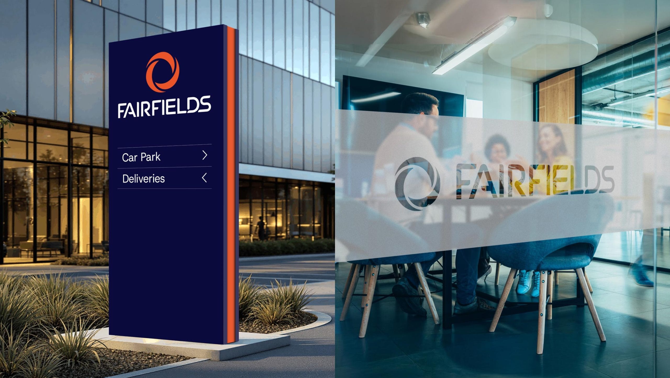
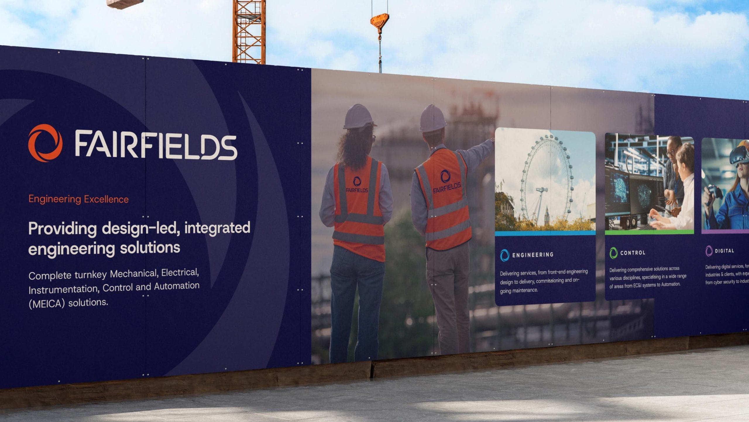
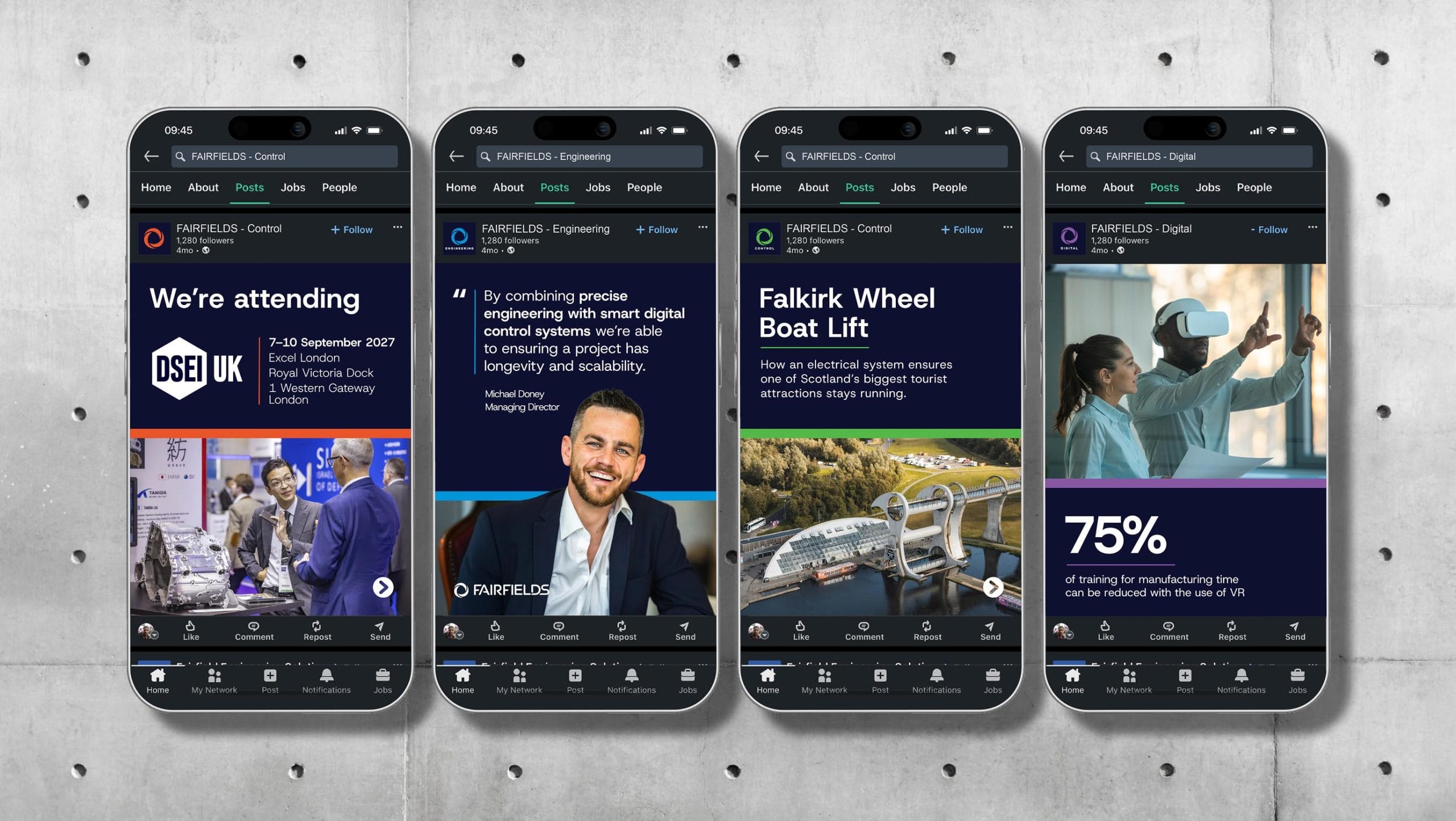
The rollout consisted of a wide range of both physical and digital applications; corporate stationery and signage, through to uniforms and digital templates. A branded experience was created to demonstrate the application of the new branding across the marketing mix and emphasise the future vision of a unified FAIRFIELDS.
We Are FAIRFIELDS
FAIRFIELDS isn’t just a single entity – it’s a multi-disciplinary group that operates with a
‘one-team’ philosophy.
The new brand identity and positioning, encapsulated in the phrase ‘We Are FAIRFIELDS’, was presented to 80 members of staff in a structured reveal session delivered by our CEO, Gerry Arcari.
The new brand has since been rolled out across all physical and digital touchpoints, including our stand design for the Mach2026 exhibition, which was the perfect platform to reveal the renewed FAIRFIELDS identity to the public.
+132%
Engineering Landing Page Sessions
+16%
Organic Search Clicks
+68%
Avg. Site Wide Engagement Time