Cultivating an independent spirit
for Integrity Malts

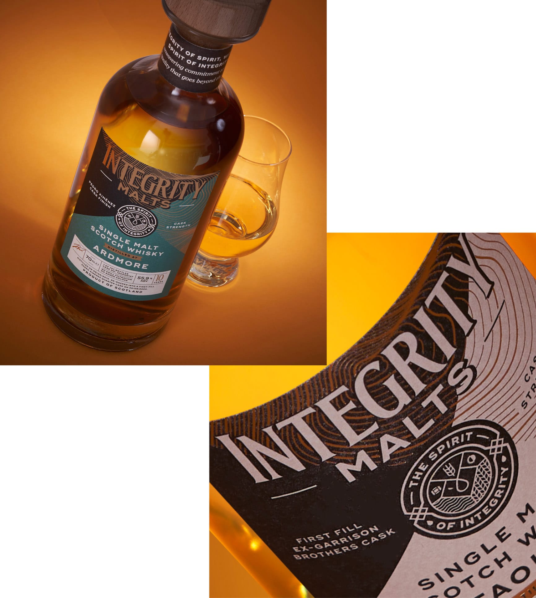
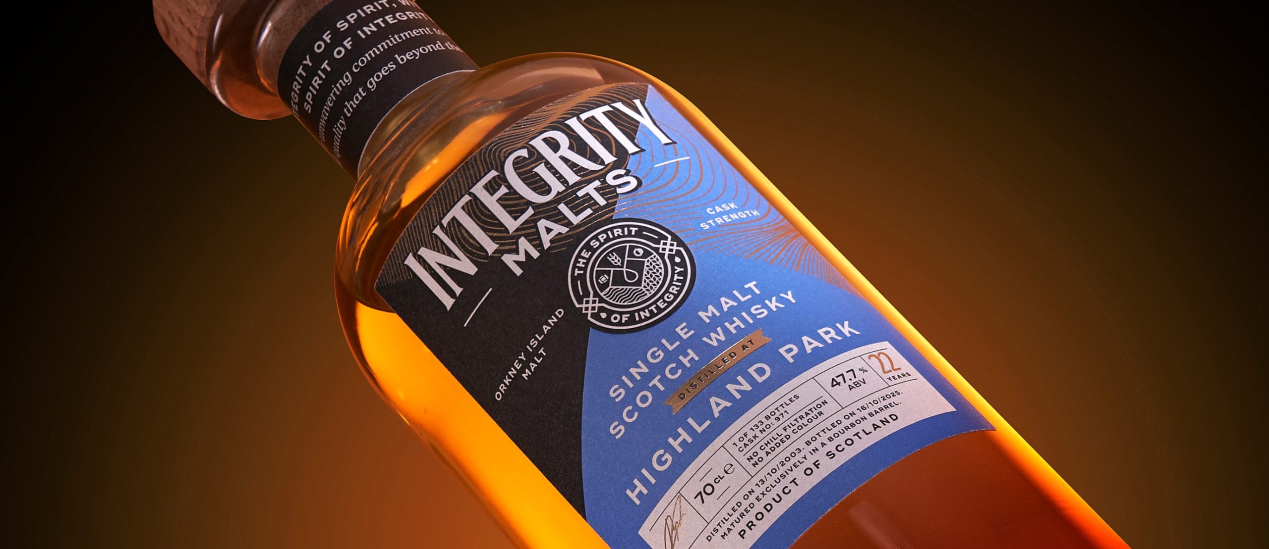
Close-up product photograph of an Integrity Malts whisky bottle illuminated with warm amber lighting, highlighting the premium label and handcrafted branding.

When Ilya and Jared launched Integrity Malts in July 2025, they had a clear vision: a strong name, a defined mission, and a passionate community of 20,000 whisky lovers. But one thing was missing – a visual identity that matched the caliber of the whisky they were crafting.

450

bottle batch sold out since July 2025 launch

20k

members in their whisky community group

33%

savings for customers buying through Still In Cask vs retail

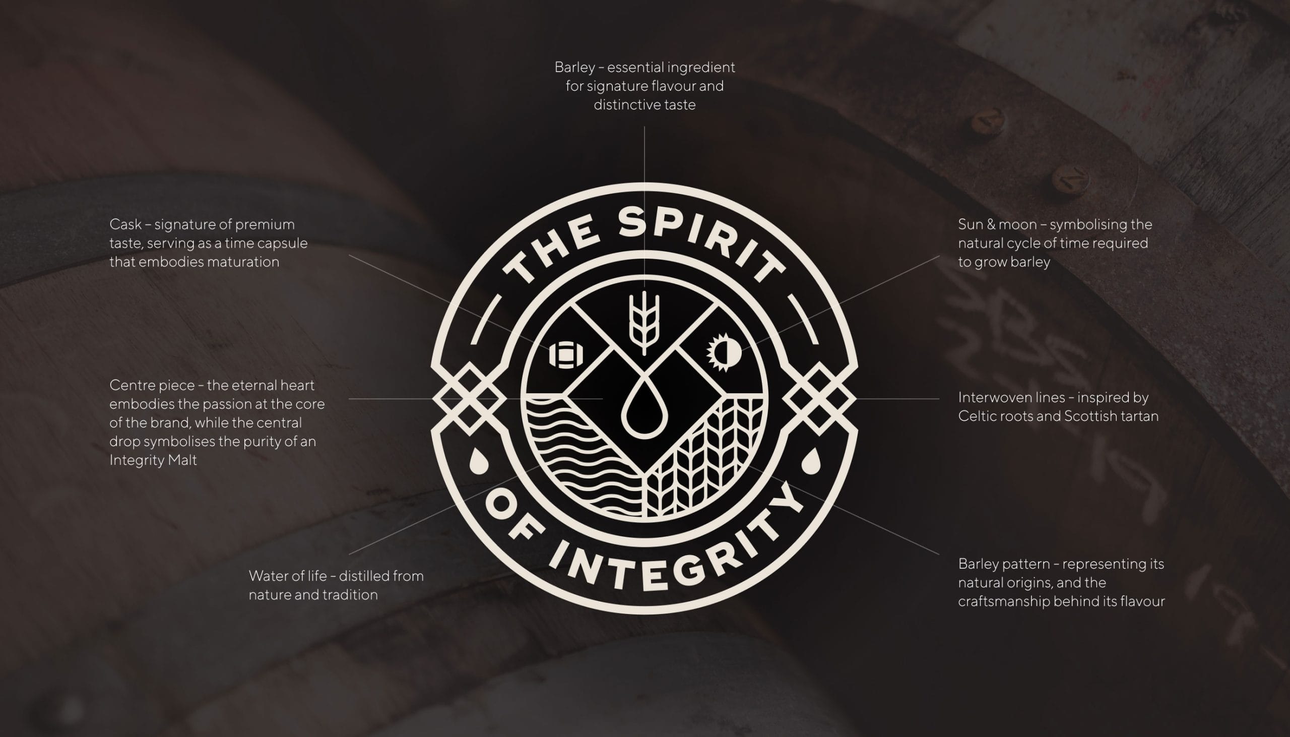
The Spirit of Integrity brand identity displayed over a whisky barrel background with annotated design elements explaining the symbolism behind the logo.
the challenge

levelling up on design

Their initial branding had done its job in building early awareness. But as they prepared for their first public releases, it was clear they needed a stronger, more distinctive look for their labelling and website – one that didn’t rely on flashy visuals, but instead let the whisky, and its spirit of integrity, speak for itself.

That’s when they got in contact with Vivid Creative.

Finding the balance

The brief came with a tricky task: design a brand that was premium and credible enough to compete with established names, modern enough to stand out, but still traditional enough to appeal to serious whisky drinkers. And it had to feel local AND rooted in Sheffield, not just in name but in spirit.

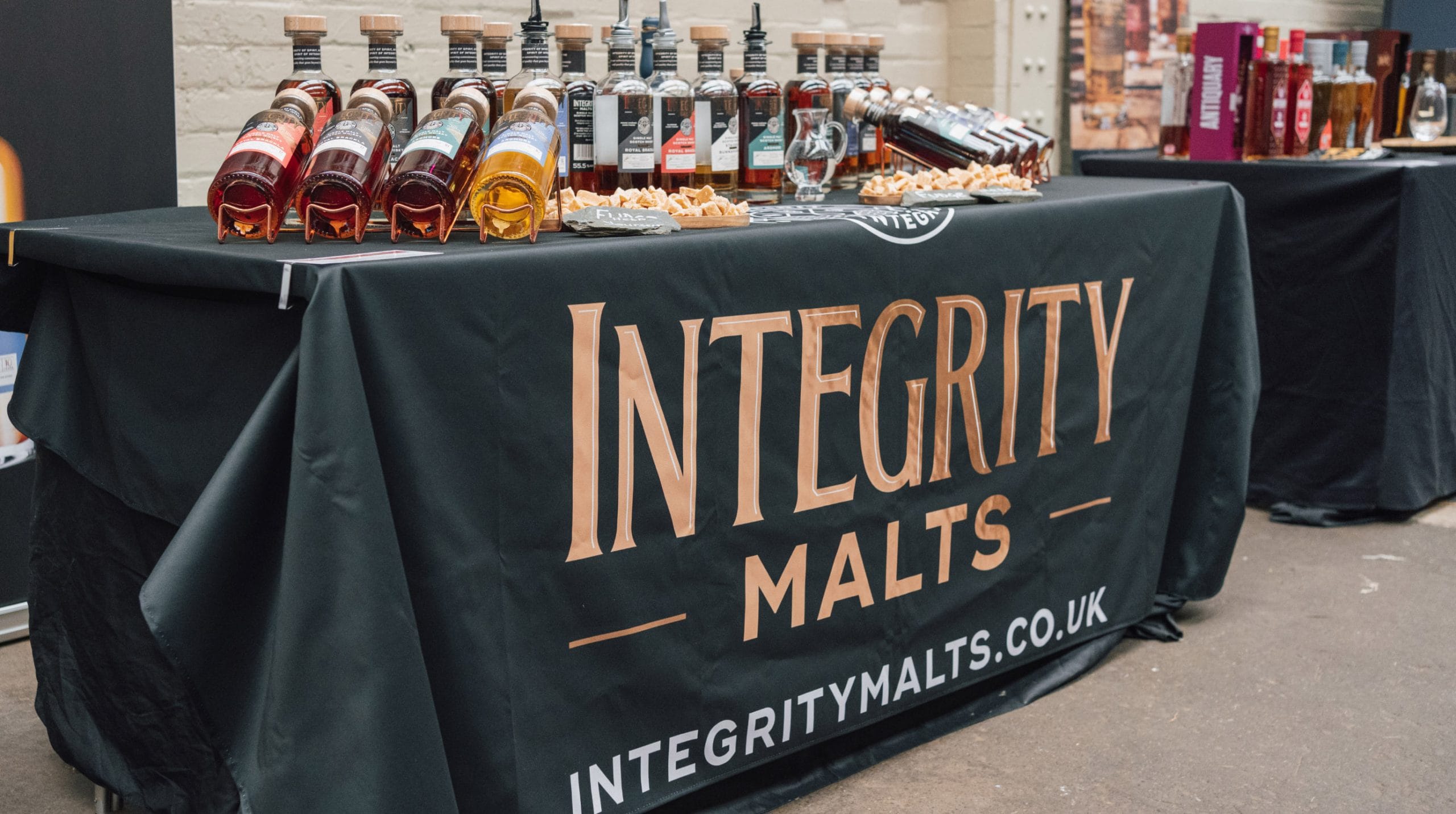
Integrity Malts branded exhibition stand displaying whisky bottles, tasting equipment and promotional table covering at a trade show or tasting event.
the solution

bridging the traditional with the modern

Our studio team focused on carving out a space between these two extremes: the old-school, heritage-heavy distilleries that make up most of the market and the ultra-modern newcomers that risk alienating traditional drinkers. The answer was a design that felt grounded in tradition but forward-looking – authentic, credible, and visually refined.

A mark that stands for something

At the center of the new identity was a completely fresh emblem – a contemporary take on a crest that visually reinforced the brand’s core promise: integrity. It looked official, confident, and trustworthy –  a modern stamp of quality.

Premium Integrity Malts whisky bottle alongside a tasting glass with close-up branding details, presented in a warm amber-toned product photography collage.
navigating

the fine print

Our design had to comply with strict Scotch Whisky Association rules, including placing the producer name as the second-largest element on the label. We worked around these limitations by building a clean, elegant layout using a modern typography that balanced sophistication with readability.

Colour coding helped distinguish expressions and improve shelf standout, while subtle touches – like gold foiling, topographic lines of the Highlands, and founder signatures – added richness and depth. The result was a layered, meaningful design that balanced modern appeal with whisky-world credibility.

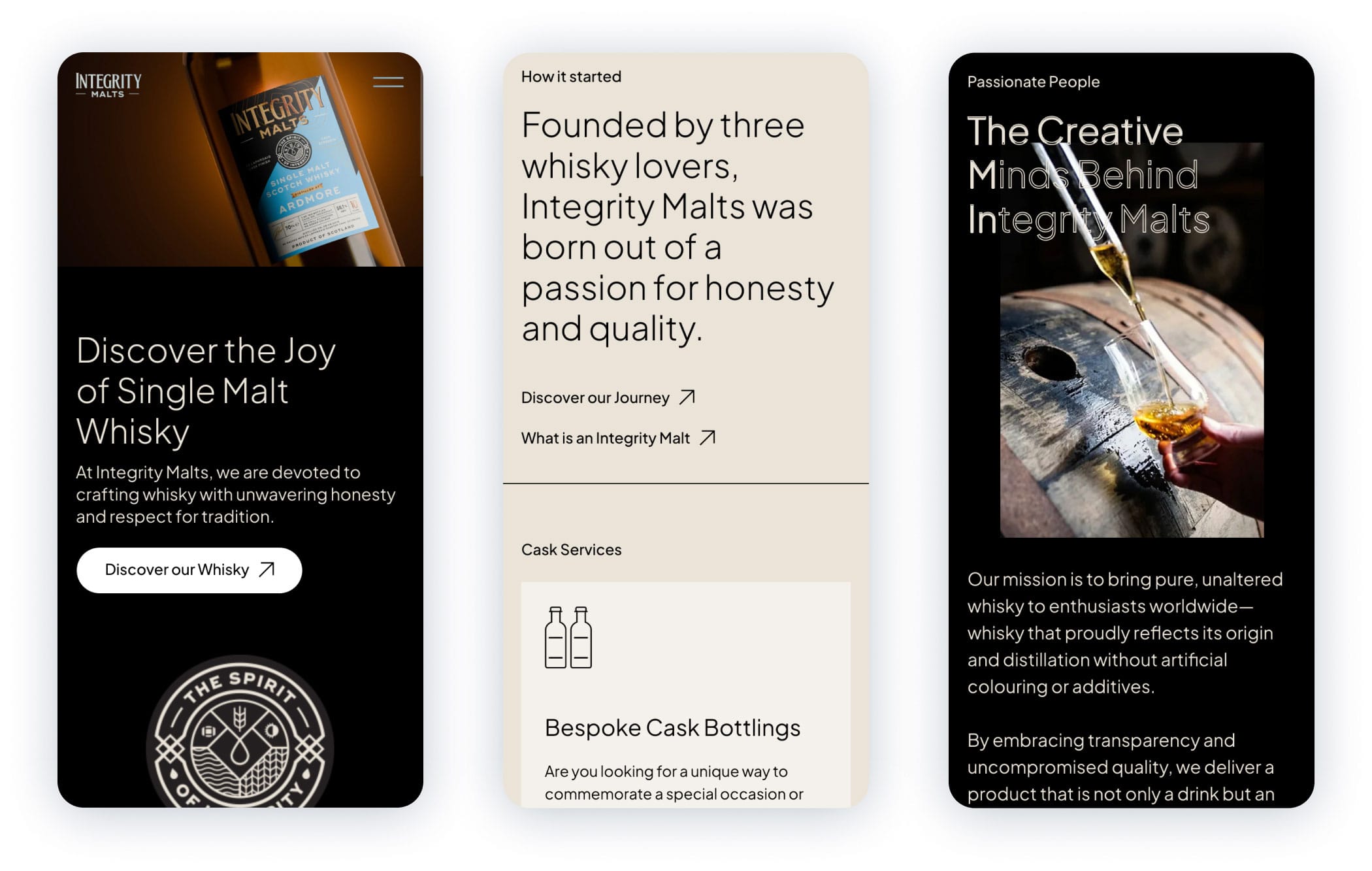
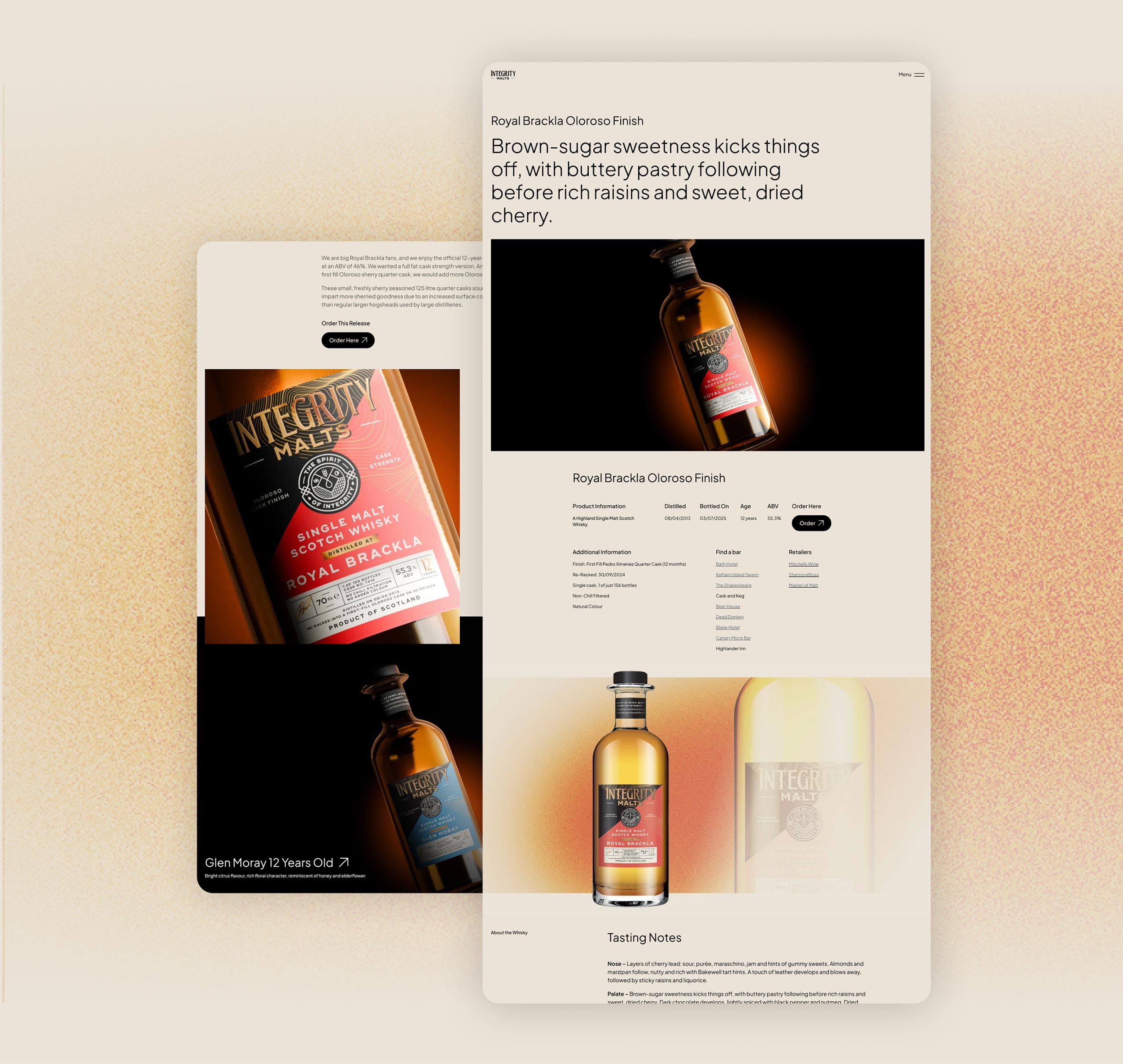
This new identity extended online too, with a website showcasing moody, dramatic imagery that kept the spotlight firmly on the product.

Mobile website concepts for Integrity Malts displayed across three smartphone mock-ups featuring whisky products, company story and brand content.
Mock-up of the Integrity Malts whisky product page displayed across layered website screens featuring premium bottle photography and tasting notes.
the partnership

local at heart

For Ilya, working with a local team proved just as important as the design itself. At Sheffield’s Seven Hills Whisky Festival held at The Steamworks, this sentiment came to the fore as we visited the Integrity Malts stall to see the final product. It was a testament to the warm and welcoming nature of the Sheffield business community.

the results

ready for the big leagues

The new brand identity faced a real-world test at the Whisky Festival and passed with flying colours. Even seasoned whisky enthusiasts picked up the bottles, appreciated the design, tasted the golden nectar, and bought their own tasty keepsakes.

A sell-out launch

From their initial July 2025 release (450 bottles across three expressions) Integrity Malts sold out within a few months. The fourth release saw a third of the bottles pre-sold before they even hit shelves, with demand growing in Germany and talks underway in South Korea.

In the UK, they have expanded beyond Sheffield, landing on shelves at national retailer Master of Malt and securing placements in major independent drinking establishments across Kelham Island, Sharrow Vale, and Chapel Town.

The website redesign served its purpose excellently, with clear storytelling and strong visibility. More importantly, the new brand gave Integrity Malts the authority and confidence to pursue big ambitions: a decade-long pipeline of releases and bold market expansion plans.

What started as a label and website redesign turned into a complete brand transformation – one that embodied Integrity Malts’ mission and gave them even more credibility to grow.
450

bottle batch sold out since July 2025 launch

20k

members in their whisky community group

33%

savings for customers buying through Still In Cask vs retail

Vivid Creative brought the brand to life. We sat down in the room with the team, looked at some of their previous work and thought, 'Wow, that was good.' Then the designs came through and I could see my business partner smiling. I'm like, 'Yeah, I think it looks really good.' The website gets really great feedback and everyone loves it. I would definitely recommend Vivid Creative.

Ilya Bykov, Co-founder, Integrity Malts